Get One Piece Done
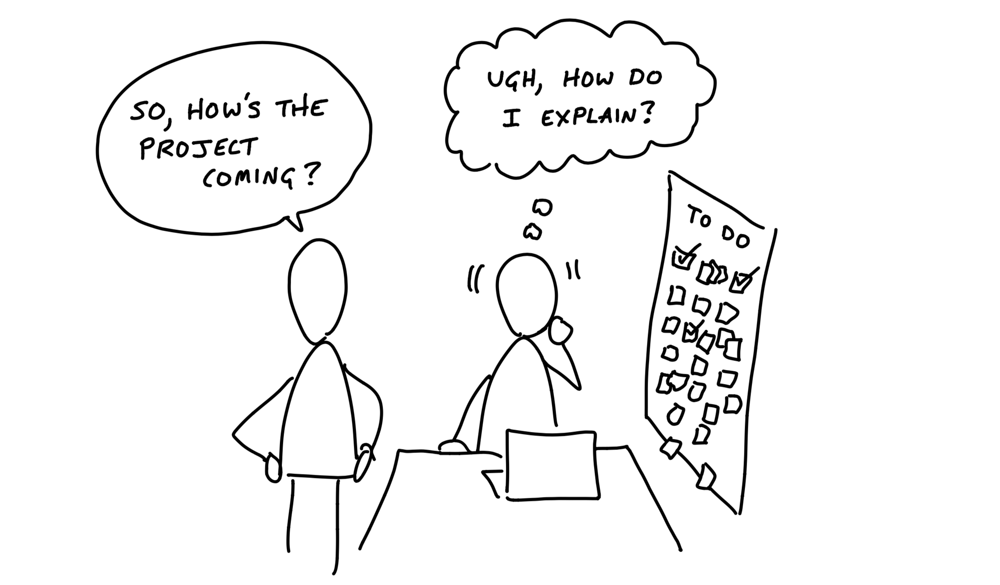
As the team gets oriented, they start to discover and track the tasks they need to do to build the project. It’s important at this early phase that they don’t create a master plan of parts that should come together in the 11th hour. If the team completes a lot of tasks but there’s no “one thing” to click on and try out, it’s hard to feel progress. A team can do a lot of work but feel insecure because they don’t have anything real to show for it yet.
Lots of things are done but nothing is really done.
Instead they should aim to make something tangible and demoable early—in the first week or so. That requires integrating vertically on one small piece of the project instead of chipping away at the horizontal layers.
Integrate one slice
We can think of projects in two layers: front-end and back-end, design and code. While technically speaking there are more layers than this, these two are the primary integration challenge in most projects.
Suppose the project starts with a lot of design. The team could design a variety of screens and even implement them as templates or views. But until they’re wired to a backend, nothing does anything. The work remains hypothetical and speculative.

Same with the backend. A lot of tasks could be checked off, but without any UI—what can you do with it? How do you judge if the work on a specific piece of business logic is really right without interacting with it?

What we want instead is to pick off one slice of the project to integrate. Then when that’s done, the team has something tangible that they’ve proven to work (or not work and reconsider). Anyone can click through the interaction and see if the feature does what it should and if what it does is what they want.

Case study: Clients in projects
We built a feature in Basecamp 3 that allowed service firms to invite clients to their projects and share chosen documents, messages, or to-do lists with them. The concept, defined in the pitch, had a variety of moving parts:
- Client Access: Before this feature, Basecamp’s access model was all or nothing. We needed a way to invite some people to see just some parts of a project. This had major back-end and caching implications.
- Client Management: We needed a way to add clients to projects and the ability to manage clients separately from team members.
- Visibility Toggle: Each piece of content in a project should have a toggle to expose it to clients or not.
The team had one designer and one programmer.
After they got oriented and familiar with how the existing code worked, the designer chose the visibility toggle as the best place to integrate first. This was the most central piece of UI in the project. It’s the one that would appear in demo videos and the interaction customers would use most.
The designer didn’t make a pixel-perfect mockup. Instead, he experimented with different affordances and placements in the app’s HTML templates. Should the toggle be two radio buttons, a checkbox, or a custom button that changes state?
Meanwhile, the programmer wasn’t waiting around. He had enough guidance from the pitch to start spiking the access model.
As soon as the designer felt confident in the basic direction of the UI, he pinged the programmer and showed him the stubbed toggle.
Stepping away from the access problem for a bit, the programmer wired the toggle enough so that it would appear on all the supported content types, change state when clicked, and save its state in the database.
At this point, the toggle didn’t actually change the visibility of the content. But it worked from the service firm’s point of view. The designer could click it, feel it, and judge how well it worked with live data on a staging server.
There was still more design work to do on the toggle. But the programmer didn’t need to be involved anymore. With the affordance wired up, the designer could continue to experiment with copy, placement, color, mobile view rendering, and more. Meanwhile, the programmer could get back to the access model or whatever else was most important to tackle next.
About three days after the start of the project, the designer demoed the working toggle to a manager.
Their conversation led to a few more tweaks and then they were able to call the toggle “done.” One important piece of the project was designed, implemented, demoed, and settled. The team felt good about showing tangible progress. And the team and management both felt confidence in the project by seeing a working piece. By clicking through a core interaction early, they were able to validate that what they hoped would make sense in theory did indeed look right and make sense in practice.
This short example illustrates a few points about how the teams integrate over short periods to finish one piece of the project at a time.
Programmers don’t need to wait
Because the important moving parts were already defined in the shaping process, programmers don’t need to sit idle waiting for design when the project starts. There’s enough direction in the pitch for them to start working on back-end problems from the start.
They won’t be able to take a piece of functionality to completion without knowing where it leads on the front-end, but there should be enough information in the pitch to inform foundational modeling decisions.
Affordances before pixel-perfect screens
Programmers don’t need a pixel-perfect design to start implementing. All they need are endpoints: input elements, buttons, places where stored data should appear. These affordances are the core of a user interface design.
Questions about font, color, spacing, and layout can be resolved after the raw affordances are in place and hooked up in code. Copywriting, basic affordances, and some wiring are all we need to try a live working version in the browser or on the device. Then we can answer the fundamental questions early: Does it make sense? Is it understandable? Does it do what we want?
That means the first interface a designer gives to a programmer can look very basic, like the example below.
It’s more like a breadboard than a visual design or a polished mock-up.
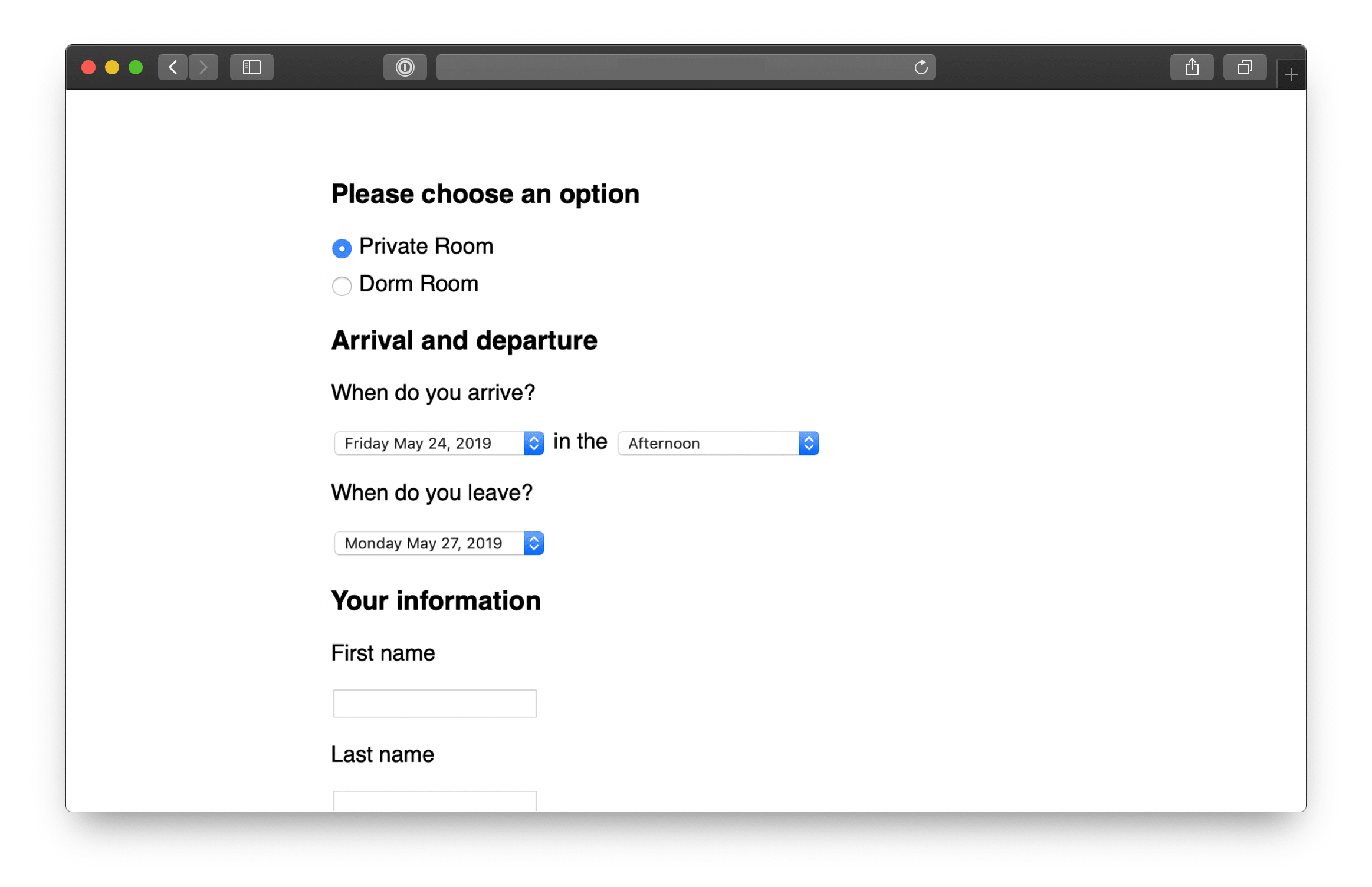
This screenshot is from a registration app for multi-day courses. The designer made it in HTML by hand.
There’s barely any style — just enough visual hierarchy to feel confident that the layout is usable and amenable to future layers of styling.
While the design looks simple, a lot of decisions are reflected in it.
- The decision to ask for arrival time but not departure time came from detailed discussions about the business logic and pricing model.
- The specific options in the arrival time pulldown correspond to rules that had to be worked out about when to charge for meals and overnight stays.
- The designer’s first sketches used a calendar-style date picker for the arrival and departure days. But that led to UX problems. Some courses were long (multiple weeks) with different phases. There wasn’t room in a standard calendar-style date picker to label the phases on the day boxes. With a pulldown, she could use option groups to label groups of dates when needed. That way users wouldn’t need to reference a schedule elsewhere to be sure they were selecting the right dates.
Here’s another example.
This is the first working piece of an app for capturing data from customer interviews.
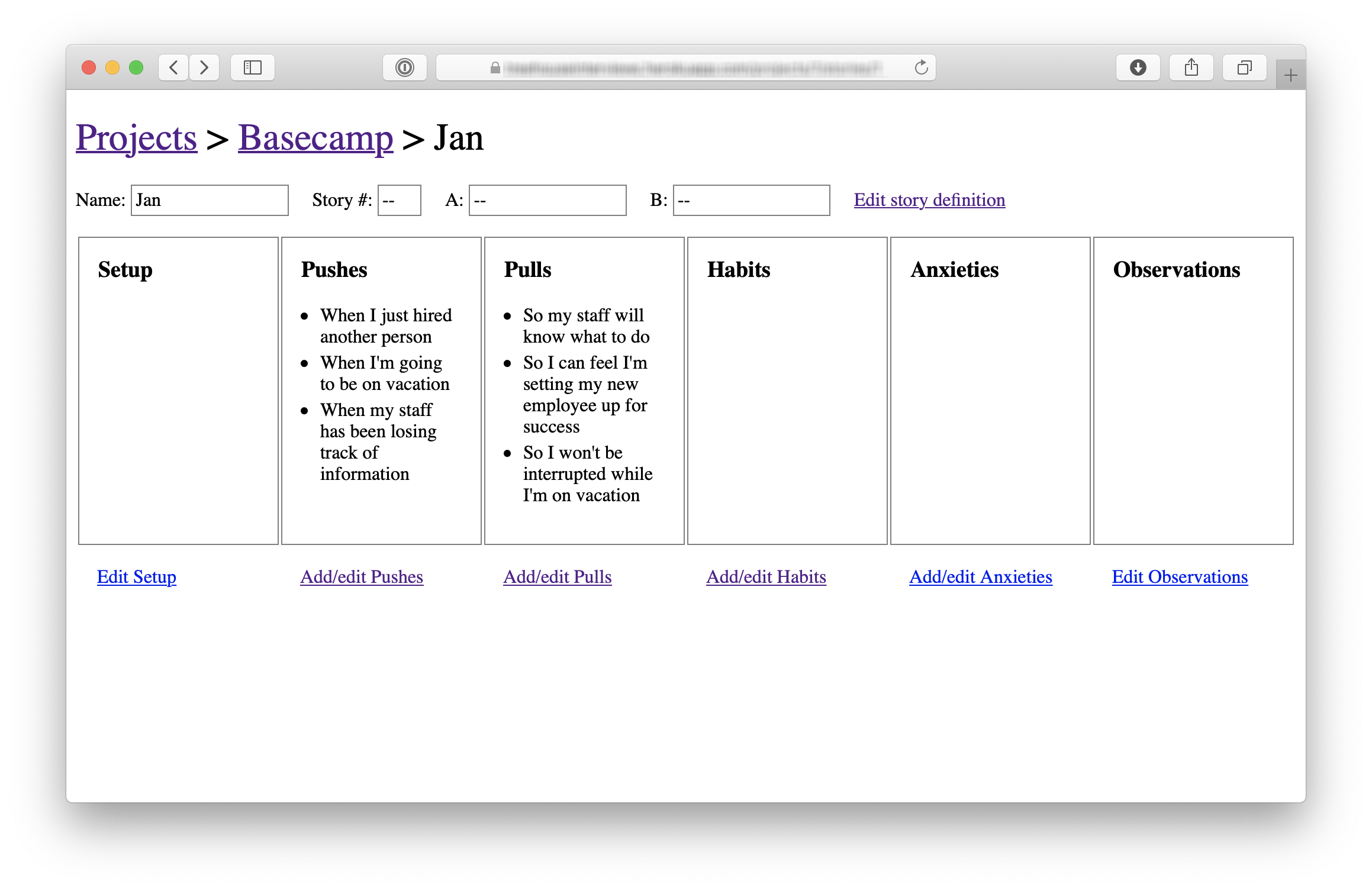
At this early stage the project name (Basecamp) and interview subject (Jan) were hard-coded and most of the links didn’t go anywhere.
Look at how raw this design is. The actions are plain text links in the default blue and purple browser colors. The boxes containing the data points are barely styled with plain black borders.
As rough as it is, this design tests some important trade-offs. The designer chose to show as much data as possible above the fold so it would be easy to review interviews. That didn’t leave enough room within each section for UI to add, edit, or remove data points. That led the designer to create separate screens for adding and editing data per section.
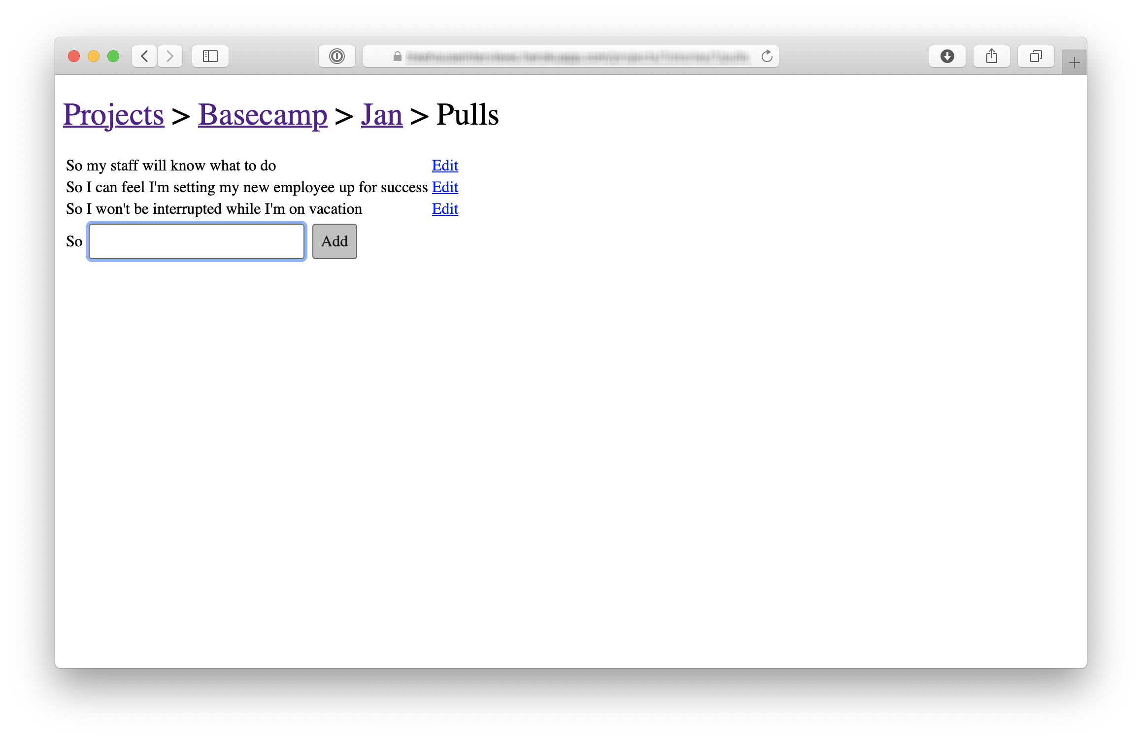
This is the first design for adding and editing “pulls” — a type of data in this interview technique. Again, look at how raw it is. There’s just enough design here to quickly wire it up and test it. The team can click through this to judge whether navigating to a separate screen to record data is acceptable or not. If it works, they can layer on additional styling later. If it doesn’t work, they didn’t waste a lot of time implementing a pixel-perfect design.
Beautiful alignment, colors, and typography don’t matter on the first pass. Visual styling is important in the end product, not in the early stages. The biggest uncertainties are about whether it will work, whether it will make sense, and how hard it will be to implement.
After the elements are wired up, they can be rearranged, restyled, and repainted to improve the work that’s already done. First make it work, then make it beautiful.
Program just enough for the next step
The same is true for back-end work. It doesn’t have to be all or nothing. Sometimes a designer just needs some scaffolding—a couple fields that save data or some code to navigate from one stubbed screen to another. Other times she needs to populate a variable in the template with a collection of real data so she can iterate on different displays (rows, columns, media boxes, etc) to find the best design.
The early back-end work can be strategically patchy. There might be a controller to render templates but no model. Or a controller and bits of a model with mock data but no support for creating or updating the data.
Screens that aren’t wired yet could at least be connected with routes for navigating between them.
When it was time to test the first piece of the interview app, the team knew there would be sensitive data from real interviews going into it. They needed to protect it with some kind of authentication. Rather than building full username and password support—or even integrating a third-party solution—they just used plain HTTPAuth to hard-code a password.
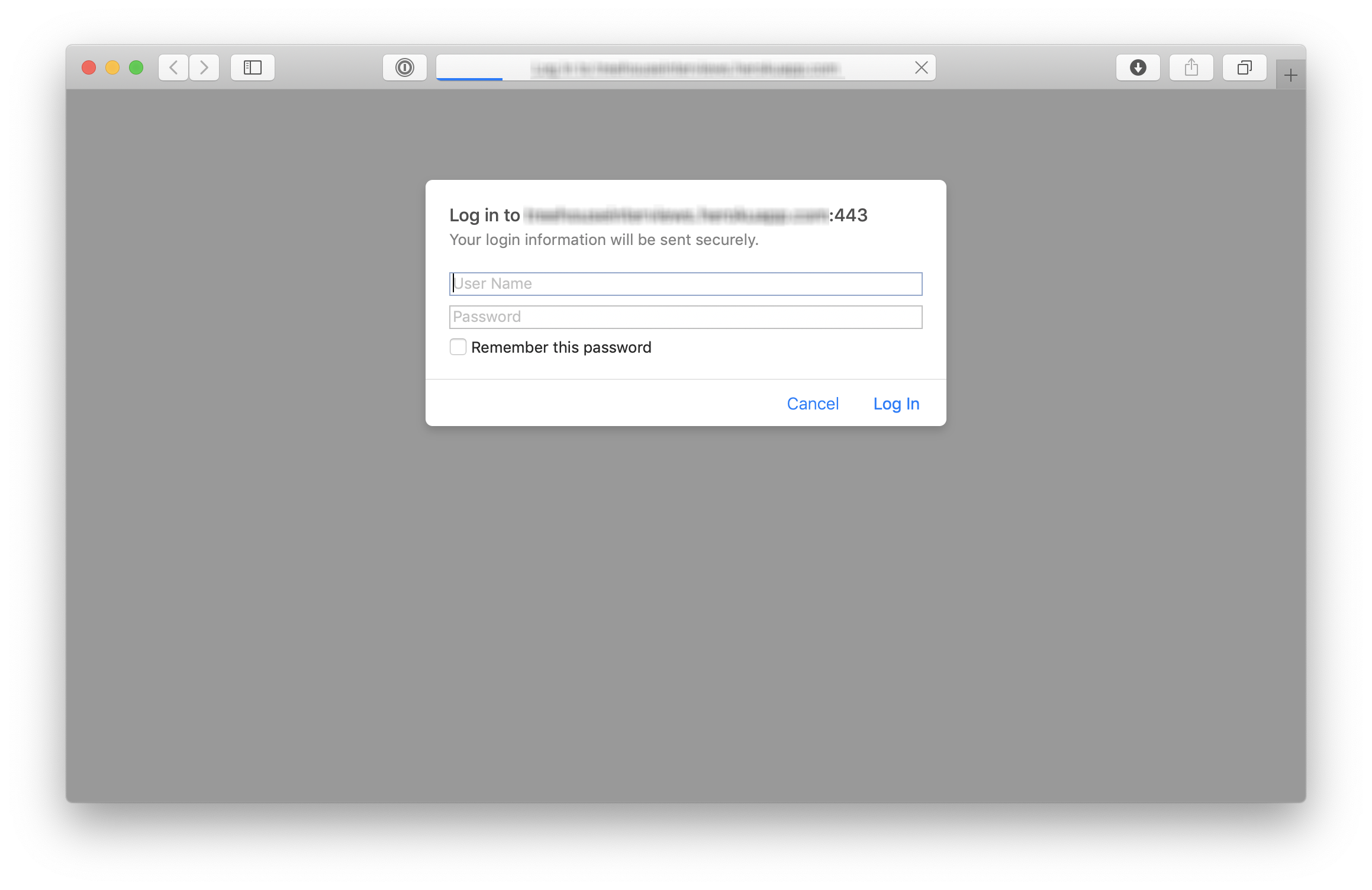
This allowed the team to try adding data from real interviews very early in the cycle, without slowing down to hook up some authentication code that wasn’t going to teach them anything about the problems they were trying to solve.
The point is to create a back-and-forth between design and programming on the same piece of the product. Instead of one big hand-off, take turns layering in affordances, code, and visual styling. Step by step, click through the real working feature-in-progress to judge how it’s coming and what to do next.
Start in the middle
In the examples above, the team didn’t build log in first. They didn’t build a way to create an interview project and an interview subject before solving the problem of adding interview data.
They jumped straight into the middle where the interesting problem was and stubbed everything else to get there.
To expand on this, here are three criteria to think about when choosing what to build first:
First, it should be core. The visibility toggle was core to the Clients in Projects concept. Without it, the other work wouldn’t mean anything. Contrast that with a more peripheral aspect of the project, like the ability to rename a client. Both were “required,” but one was more central and important to prove out early in the cycle. In the interview app, recording interview data was more core—more in the middle—than setting up a new research project.
Second, it should be small. If the first piece of work isn’t small enough, there isn’t much benefit to carving it off from the rest. The point is to finish something meaningful in a few days and build momentum—to have something real to click on that shows the team is on the right track.
Third, it should be novel.
If two parts of the project are both core and small, prefer the thing that you’ve never done before. In the Clients in Projects feature, the UI for adding clients was mostly the same as the UI for adding regular users. Starting on that would have moved the project forward, but it wouldn’t have taught the team anything. It wouldn’t have eliminated uncertainty. Starting with the visibility toggle boosted everyone’s confidence because it proved that a new idea was going to work.